How to Use Color in Photography
At a technical level, color can be complicated; just see our recent article on sRGB vs Adobe RGB vs ProPhoto RGB. But at an artistic level, it is one of the most important parts of an image, impacting emotions and interest unlike almost any other element of photography. This article introduces the concepts of color and color relationships, including how to use them to take the best possible photographs.
Table of Contents
- Warm vs Cool Colors
- Examining the Emotions of Each Color
- Color Harmonies and Relationships
- Conclusion
على المستوى الفني، يمكن أن يكون اللون معقدًا؛ ما عليك سوى الاطلاع على مقالتنا الأخيرة حول sRGB وAdobe RGB وProPhoto RGB. ولكن على المستوى الفني، فهو أحد أهم أجزاء الصورة، حيث يؤثر على المشاعر والاهتمام على عكس أي عنصر آخر في التصوير الفوتوغرافي تقريبًا. تقدم هذه المقالة مفاهيم اللون وعلاقات الألوان، بما في ذلك كيفية استخدامها لالتقاط أفضل الصور الفوتوغرافية الممكنة.
جدول المحتويات
الألوان الدافئة مقابل الألوان الباردة
دراسة عواطف كل لون :
تناغم الألوان والعلاقات
الألوان الدافئة والباردة
الألوان المكملة والعلاقات الأخرى
الخاتمة
Warm vs Cool Colors
The two broad types of color are warm and cool. Warm colors include red, orange, and yellow, while cool colors include green, blue, and violet. The two categories of color have their own moods, and it helps to ask yourself which ones you’re photographing at a given time if you want to optimize how your photos look.
Warm colors are more active and emotionally charged. They jump out at the viewer, attracting attention and drawing interest. In general, warm colors are rarer than cool colors, so an image which has even a small splash of warmth can stand out. This is one reason why photos at sunset and sunrise, as well as fall colors, are as popular as they are.
Cool colors, on the other hand, are more subdued and gentle. They fade into the background, particularly if a warm color appears in the same spot. In general, they don’t attract the same degree of attention as a warm color, though that certainly isn’t a bad thing. Warm colors can be overpowering; cool colors are more likely to appear soothing and calm. Much of nature is made of cool colors, although sunset and sunrise can turn even a blue landscape golden.
Below, I’ll cover each of the six main colors – red, orange, yellow, green, blue, and violet – as well as the emotions that are generally associated with each. Keep in mind that emotion is a tricky part of photography to pin down, and you can take pictures which don’t have the following emotions simply by altering your choice of subject or composition. But the following effects do make a difference.
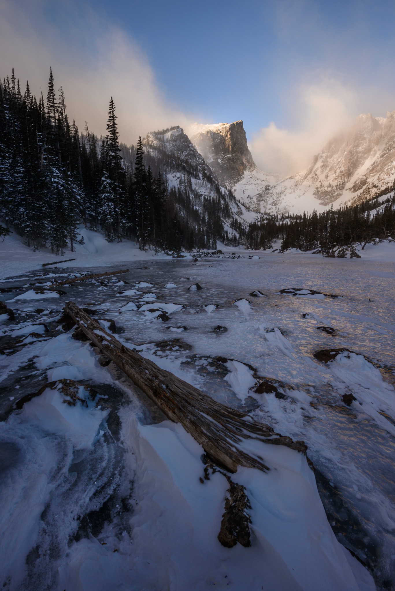
 NIKON D810 + TAMRON 15-30mm F2.8 @ 15mm, ISO 64, 1/60, f/16.0
الألوان الدافئة مقابل الألوان الباردة
النوعان الواسعان من الألوان دافئان وباردان. تشمل الألوان الدافئة الأحمر والبرتقالي والأصفر، بينما تشمل الألوان الباردة الأخضر والأزرق والبنفسجي. تتمتع فئتا الألوان بحالتهما المزاجية الخاصة، ومن المفيد أن تسأل نفسك عن الألوان التي تقوم بتصويرها في وقت معين إذا كنت تريد تحسين مظهر صورك.
الألوان الدافئة أكثر نشاطًا وشحنًا عاطفيًا. يقفزون نحو المشاهد ويجذبون الانتباه ويجذبون الاهتمام. بشكل عام، الألوان الدافئة أندر من الألوان الباردة، لذلك يمكن للصورة التي تحتوي حتى على دفقة صغيرة من الدفء أن تبرز. وهذا هو أحد الأسباب التي تجعل الصور عند غروب الشمس وشروقها، وكذلك ألوان الخريف، تحظى بشعبية كبيرة.
من ناحية أخرى، الألوان الباردة أكثر هدوءًا ولطفًا. فهي تتلاشى في الخلفية، خاصة إذا ظهر لون دافئ في نفس المكان. بشكل عام، فهي لا تجتذب نفس الدرجة من الاهتمام مثل الألوان الدافئة، على الرغم من أن هذا ليس بالأمر السيئ بالتأكيد. يمكن أن تكون الألوان الدافئة طاغية؛ من المرجح أن تبدو الألوان الباردة مريحة وهادئة. تتكون معظم الطبيعة من ألوان باردة، على الرغم من أن غروب الشمس وشروقها يمكن أن يحول حتى المناظر الطبيعية الزرقاء إلى اللون الذهبي.
أدناه، سأغطي كل لون من الألوان الستة الرئيسية – الأحمر والبرتقالي والأصفر والأخضر والأزرق والبنفسجي – بالإضافة إلى المشاعر المرتبطة بشكل عام بكل منها. ضع في اعتبارك أن العاطفة جزء يصعب تحديده في التصوير الفوتوغرافي، ويمكنك التقاط صور لا تحتوي على المشاعر التالية ببساطة عن طريق تغيير اختيارك للموضوع أو التكوين. لكن التأثيرات التالية تحدث فرقًا.
نيكون D810 + تامرون 15-30 ملم، F2.8 @ 15 ملم، ISO 64، 1/60، f/16.0
Examining the Emotions of Each Color
1. Red
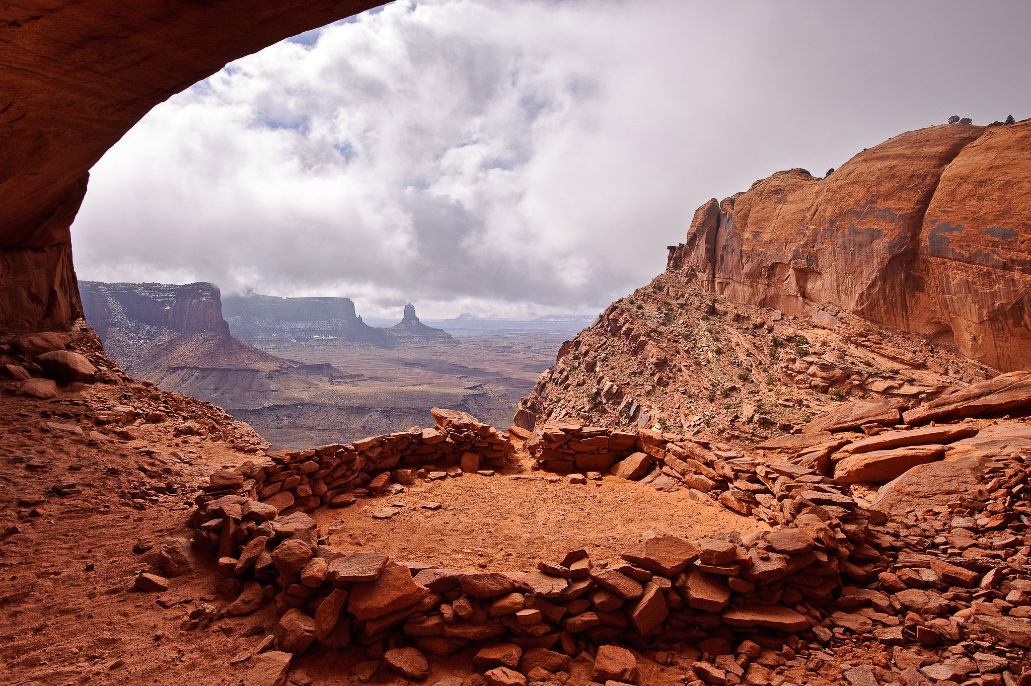
As one of the rarest and most powerful colors in nature, red is particularly important to photographers. With the historic associations between the color red and the emotions of passion and excitement, it’s no surprise that this is a very active color. It can also be too intense for certain images; a little red goes a long way.
To find red in nature, look for leaves in autumn, red rocks in places like the American Southwest, or the occasional vivid sunset. In other genres of photography, like portraiture, keep in mind that any red your subject wears will draw the eye, whether clothing or makeup. And with wildlife photography, red subjects – such as the bright eyes of a tree frog or a cardinal against the snow – have immediate sticking power.
 Dead Horse Point Sunrise, Nasim Mansurov
فحص العواطف من كل لون
1. إد
باعتباره واحدًا من أندر وأقوى الألوان في الطبيعة، فإن اللون الأحمر له أهمية خاصة للمصورين. مع الارتباط التاريخي بين اللون الأحمر ومشاعر العاطفة والإثارة، فليس من المستغرب أن يكون هذا اللون نشطًا للغاية. ويمكن أيضًا أن يكون شديدًا جدًا بالنسبة لبعض الصور؛ القليل من اللون الأحمر يقطع شوطا طويلا.
للعثور على اللون الأحمر في الطبيعة، ابحث عن أوراق الشجر في الخريف، أو الصخور الحمراء في أماكن مثل جنوب غرب أمريكا، أو غروب الشمس النابض بالحياة في بعض الأحيان. في أنواع التصوير الفوتوغرافي الأخرى، مثل صور البورتريه، ضع في اعتبارك أن أي لون أحمر يرتديه موضوعك سوف يجذب العين، سواء كان ملابسًا أو مكياجًا. ومع تصوير الحياة البرية، تتمتع الأهداف الحمراء – مثل العيون الساطعة لضفدع الشجرة أو الكاردينال في مواجهة الثلج – بقدرة التصاق فورية.
2. Orange
Compared to the color red, orange is one of the more common in nature. It’s not just sunsets, either. The color brown is typically just a darker shade of orange, and it appears in nature all the time.
Orange comes in a wide range of tonalities, from the dark brown of trees to the bright orange of a pumpkin. It conveys a feeling of warmth, and it is not as overpowering as red. But orange isn’t a passive color, either; it draws quite a bit of attention, especially when placed against a cooler background. To me, it always feels like it contains a bit of adventure.
 False Kiva, Nasim Mansurov
2. برتقالي
بالمقارنة مع اللون الأحمر، يعد اللون البرتقالي أحد أكثر الألوان شيوعًا في الطبيعة. لا يقتصر الأمر على غروب الشمس فقط. اللون البني عادة ما يكون مجرد ظل أغمق من اللون البرتقالي، ويظهر في الطبيعة طوال الوقت.
يأتي اللون البرتقالي في مجموعة واسعة من الدرجات اللونية، بدءًا من اللون البني الداكن للأشجار وحتى اللون البرتقالي الزاهي لليقطين. إنه ينقل شعورًا بالدفء، وهو ليس طاغيًا مثل اللون الأحمر. لكن اللون البرتقالي ليس لونًا سلبيًا أيضًا؛ إنه يجذب قدرًا كبيرًا من الاهتمام، خاصة عند وضعه على خلفية أكثر برودة. بالنسبة لي، أشعر دائمًا أنها تحتوي على القليل من المغامرة.
اللون الأصفر هو اللون الأكثر سطوعًا وتفاؤلًا، خاصة عندما يظهر بمفرده وليس كمزيج مع اللون البرتقالي أو الأخضر. ومع ذلك، فإن هذا اللون الأصفر المخلوط هو الأكثر شيوعًا في العالم. حتى العشب الأخضر الساطع وغروب الشمس البرتقالي الزاهي يحتوي دائمًا على عنصر من اللون الأصفر.
من ناحية أخرى، إذا راقبت ذلك، فسوف تجد اللون الأصفر بحد ذاته في الطبيعة. الرمال وأوراق الخريف وحتى الشمس في أوقات معينة من اليوم كلها صفراء زاهية، وهي تعمل بشكل جيد في الصور التي يكون هدفك فيها هو الشعور بالإيجابية والإثارة. مثل اللون الأحمر والبرتقالي، يعتبر اللون الأصفر لونًا دافئًا، وهو يلفت العين كلما ظهر. انظر عن قرب بما فيه الكفاية، وستجد طرقًا لإدراجها في صورك الفوتوغرافية.
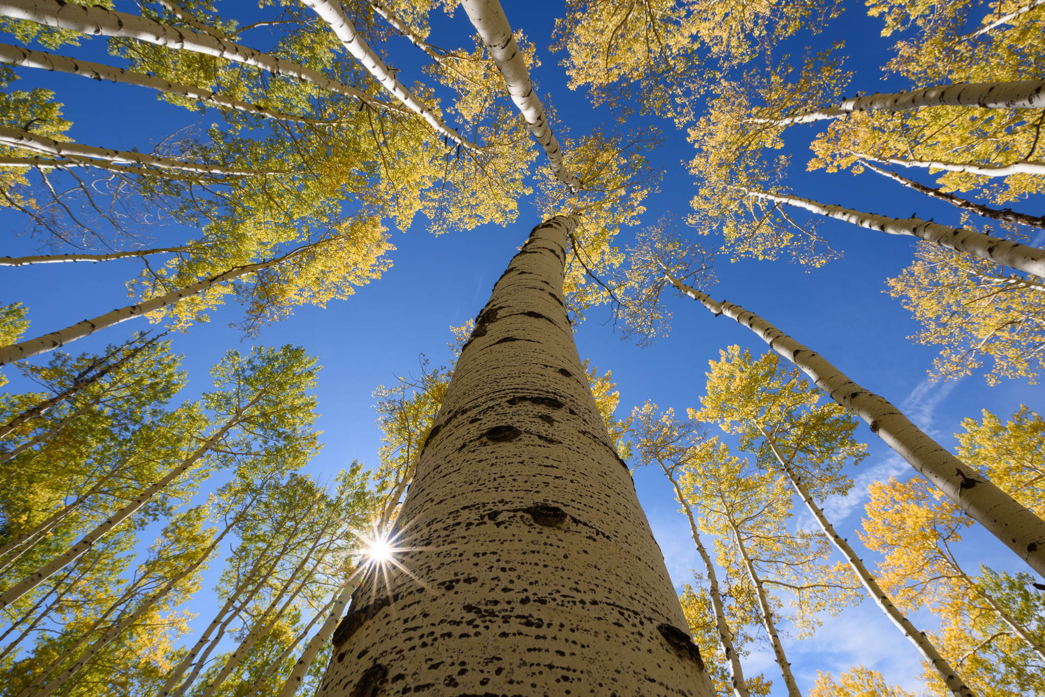
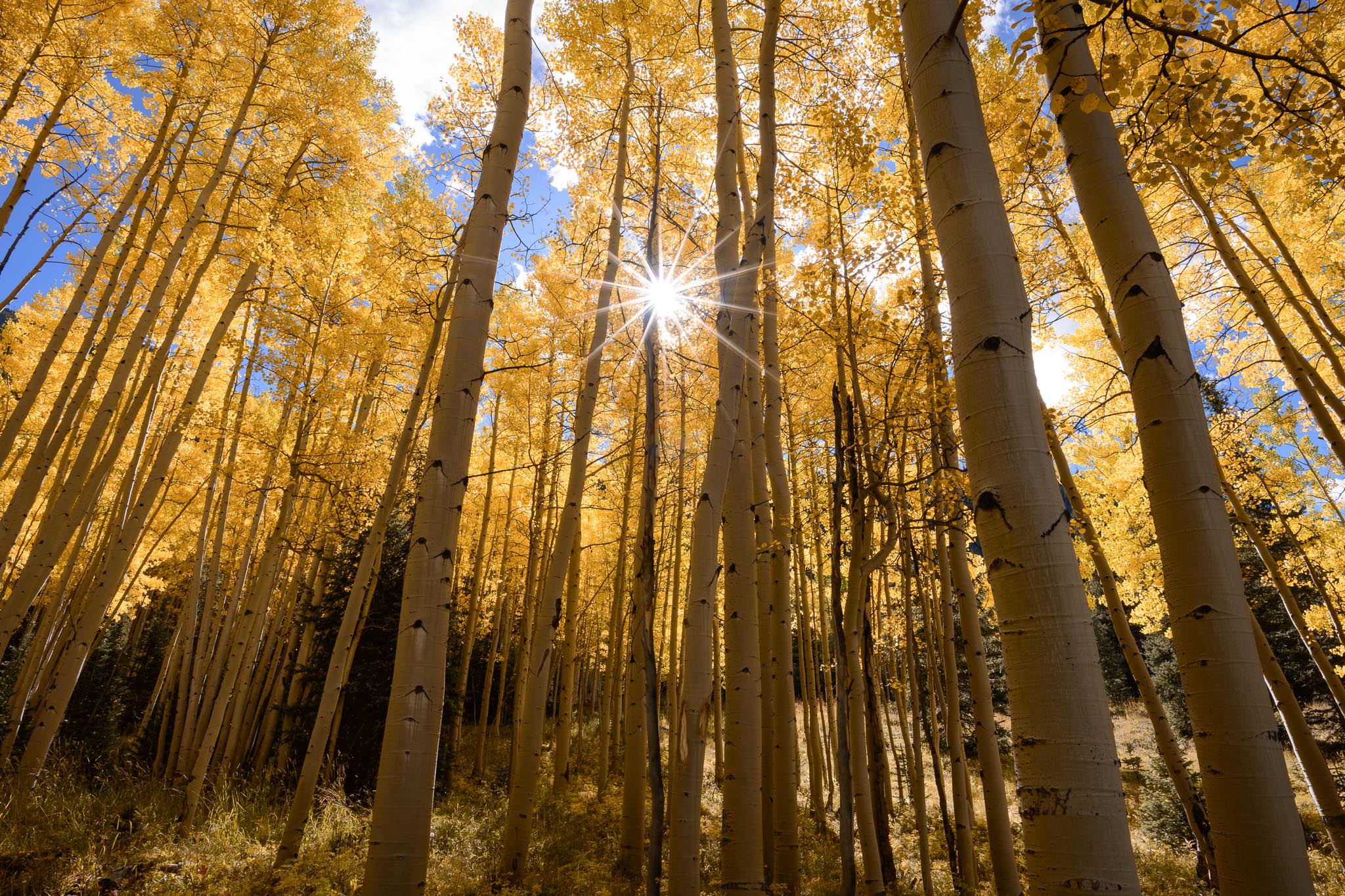
3. Yellow
Yellow is the brightest and most optimistic color, particularly when it appears on its own and not as a blend with orange or green. However, it is this blended yellow we see most commonly in the world. Even bright green grass and vivid orange sunsets almost always have a component of yellow.
On the other hand, if you keep an eye out for it, you’ll still find yellow on its own in nature. Sand, autumn leaves, and even the sun at certain times of day are all bright yellow, and they work well in photos where your goal is a sense of positivity and excitement. Like red and orange, yellow is a warm color, and it draws the eye whenever it appears. Look close enough, and you’ll find ways to include it in your photography.
 NIKON D800E + 20mm f/1.8 @ 20mm, ISO 100, 1/30, f/16.0
3. أصفر
اللون الأصفر هو اللون الأكثر سطوعًا وتفاؤلًا، خاصة عندما يظهر بمفرده وليس كمزيج مع اللون البرتقالي أو الأخضر. ومع ذلك، فإن هذا اللون الأصفر المخلوط هو الأكثر شيوعًا في العالم. حتى العشب الأخضر الساطع وغروب الشمس البرتقالي الزاهي يحتوي دائمًا على عنصر من اللون الأصفر.
من ناحية أخرى، إذا راقبت ذلك، فسوف تجد اللون الأصفر بحد ذاته في الطبيعة. الرمال وأوراق الخريف وحتى الشمس في أوقات معينة من اليوم كلها صفراء زاهية، وهي تعمل بشكل جيد في الصور التي يكون هدفك فيها هو الشعور بالإيجابية والإثارة. مثل اللون الأحمر والبرتقالي، يعتبر اللون الأصفر لونًا دافئًا، وهو يلفت العين كلما ظهر. انظر عن قرب بما فيه الكفاية، وستجد طرقًا لإدراجها في صورك الفوتوغرافية.
4. Green
Even though blue is the most common color in nature, thanks to water and sky, green is the one we most associate with life. Our visual systems recognize more shades of green than any other color. So, your photographs can include shades of deep green, vivid green, electric green, dark green, bright green, and almost endless variations thereof.
At its heart, though, green is a familiar and soothing color. Because it represents the living world, it creates a sense of calm for those of us who enjoy spending time in nature. In that sense, green is the warmest of the cool colors.
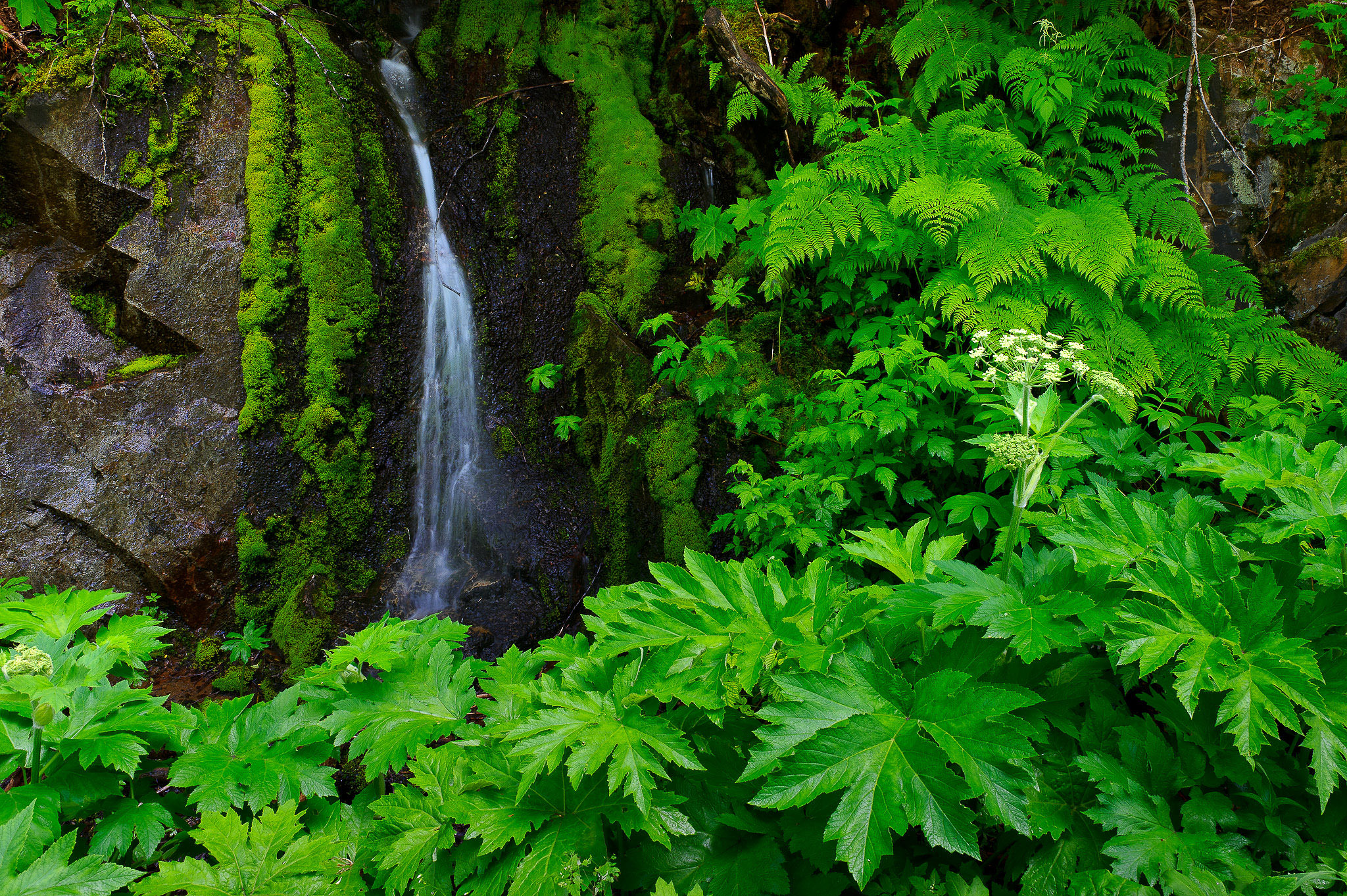 Ying Yang, Nasim Mansurov
4. أخضر
على الرغم من أن اللون الأزرق هو اللون الأكثر شيوعًا في الطبيعة، إلا أنه بفضل الماء والسماء، فإن اللون الأخضر هو أكثر الألوان التي نربطها بالحياة. تتعرف أنظمتنا البصرية على درجات اللون الأخضر أكثر من أي لون آخر. لذلك، يمكن أن تشتمل صورك الفوتوغرافية على ظلال من اللون الأخضر العميق، والأخضر الزاهي، والأخضر الكهربائي، والأخضر الداكن، والأخضر الساطع، وتنوعات لا حصر لها تقريبًا منها.
ومع ذلك، يعتبر اللون الأخضر في جوهره لونًا مألوفًا ومريحًا. ولأنها تمثل العالم الحي، فإنها تخلق إحساسًا بالهدوء لأولئك منا الذين يستمتعون بقضاء الوقت في الطبيعة. وبهذا المعنى، فإن اللون الأخضر هو أدفأ الألوان الباردة.
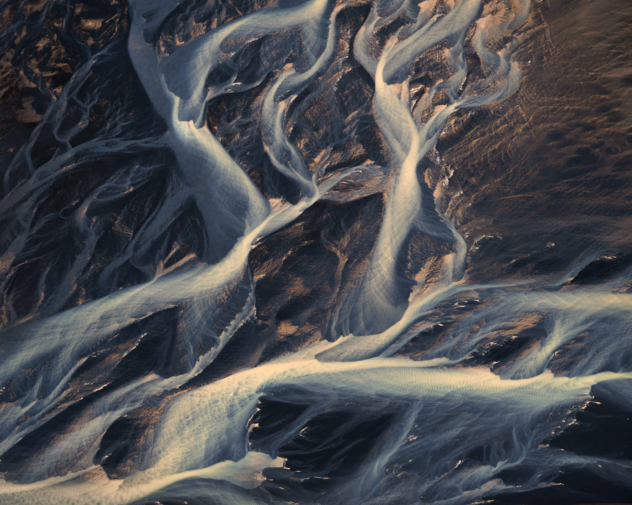
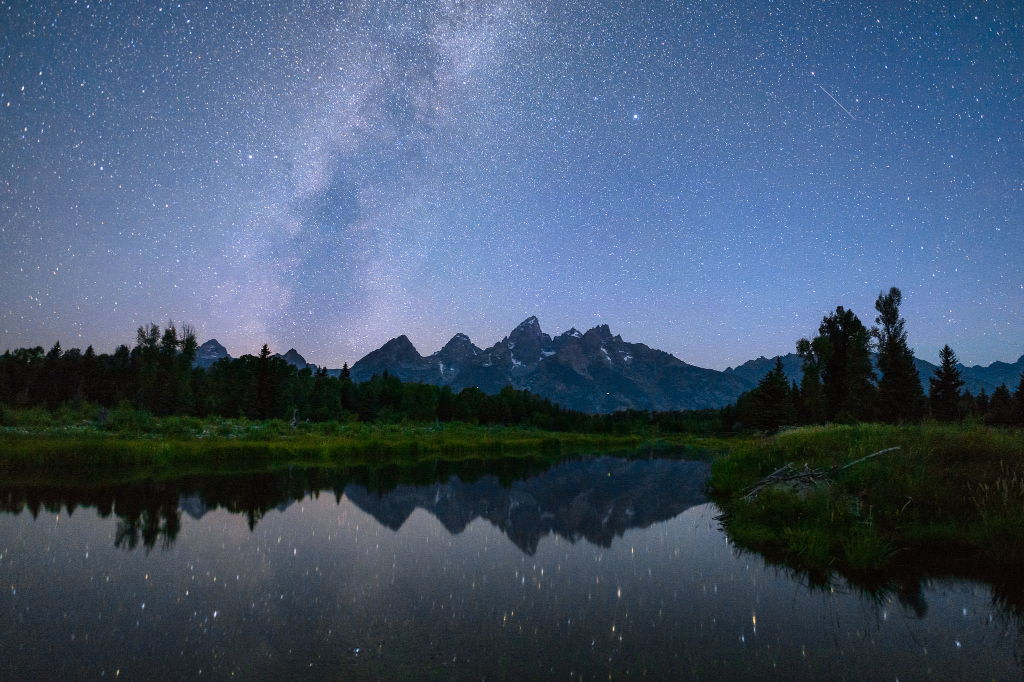
5. Blue
One of the first people to write about the relationship between color and emotion was Goethe in his 1810 Theory of Colors, in which he said that blue “draws us after it.” Today’s prevailing view isn’t so different. Perhaps this is a case where artistic tradition has overtaken reality, but maybe there’s something to it. After all, blue is associated directly with distance in the real world. Haze on the horizon, as well as the blue sky itself, both signal faraway, even unreachable destinations.
Blue, on top of that, is not a busy color. It is calmer and less flashy. A well-known fact of Instagram photography is that blue images get more likes, on average, than those with warmer colors. This is because the busy colors of red and orange do not translate as well to a smaller screen, while blue is not nearly as distracting.
Dark blue and light blue convey somewhat different emotions. Dark blue can be strong and foreboding, as in a dark cloud. Light blue is gentler and more optimistic. But both are peaceful; even a blue storm usually has an element of calm to it.
As the most common color in nature, both in the sky and in water, chances are good that you’ll find the emotions of blue in many of the photos you capture. Whether as the sole color in a calm, deep image or the background to a warm color’s attention-grabbing power, blue can complement most any emotional message in a photo with success.
 Nikon D800E + 20mm f/1.8 @ 20mm, ISO 3200, 20 seconds, f/2.2
5. الأزرق
كان جوته من أوائل الأشخاص الذين كتبوا عن العلاقة بين اللون والعاطفة في كتابه “نظرية الألوان” عام 1810، والذي قال فيه إن اللون الأزرق “يجذبنا بعده”. ولا تختلف وجهة النظر السائدة اليوم كثيراً. ربما تكون هذه هي الحالة التي تجاوز فيها التقليد الفني الواقع، ولكن ربما هناك شيء ما في ذلك. بعد كل شيء، يرتبط اللون الأزرق مباشرة بالمسافة في العالم الحقيقي. يشير الضباب في الأفق، وكذلك السماء الزرقاء نفسها، إلى وجهات بعيدة، وحتى لا يمكن الوصول إليها.
الأزرق، علاوة على ذلك، ليس لونًا مزدحمًا. إنه أكثر هدوءًا وأقل بهرجة. من الحقائق المعروفة في التصوير الفوتوغرافي على Instagram أن الصور الزرقاء تحصل على إعجابات أكثر، في المتوسط، من تلك ذات الألوان الدافئة. وذلك لأن الألوان المزدحمة باللونين الأحمر والبرتقالي لا تُترجم أيضًا إلى شاشة أصغر، في حين أن اللون الأزرق لا يشتت الانتباه تقريبًا.
ينقل اللون الأزرق الداكن والأزرق الفاتح مشاعر مختلفة إلى حد ما. يمكن أن يكون اللون الأزرق الداكن قويًا وينذر بالخطر، كما هو الحال في السحابة الداكنة. اللون الأزرق الفاتح ألطف وأكثر تفاؤلاً. لكن كلاهما سلمي. حتى العاصفة الزرقاء عادةً ما تحتوي على عنصر الهدوء.
نظرًا لكونه اللون الأكثر شيوعًا في الطبيعة، سواء في السماء أو في الماء، فمن المحتمل أن تجد مشاعر اللون الأزرق في العديد من الصور التي تلتقطها. سواء كان اللون الوحيد في صورة هادئة وعميقة أو خلفية لقوة جذب الانتباه للون الدافئ، يمكن للون الأزرق أن يكمل أي رسالة عاطفية في الصورة بنجاح.
نيكون D800E + 20 مم f/1.8 @ 20 مم، ISO 3200، 20 ثانية، f/2.2
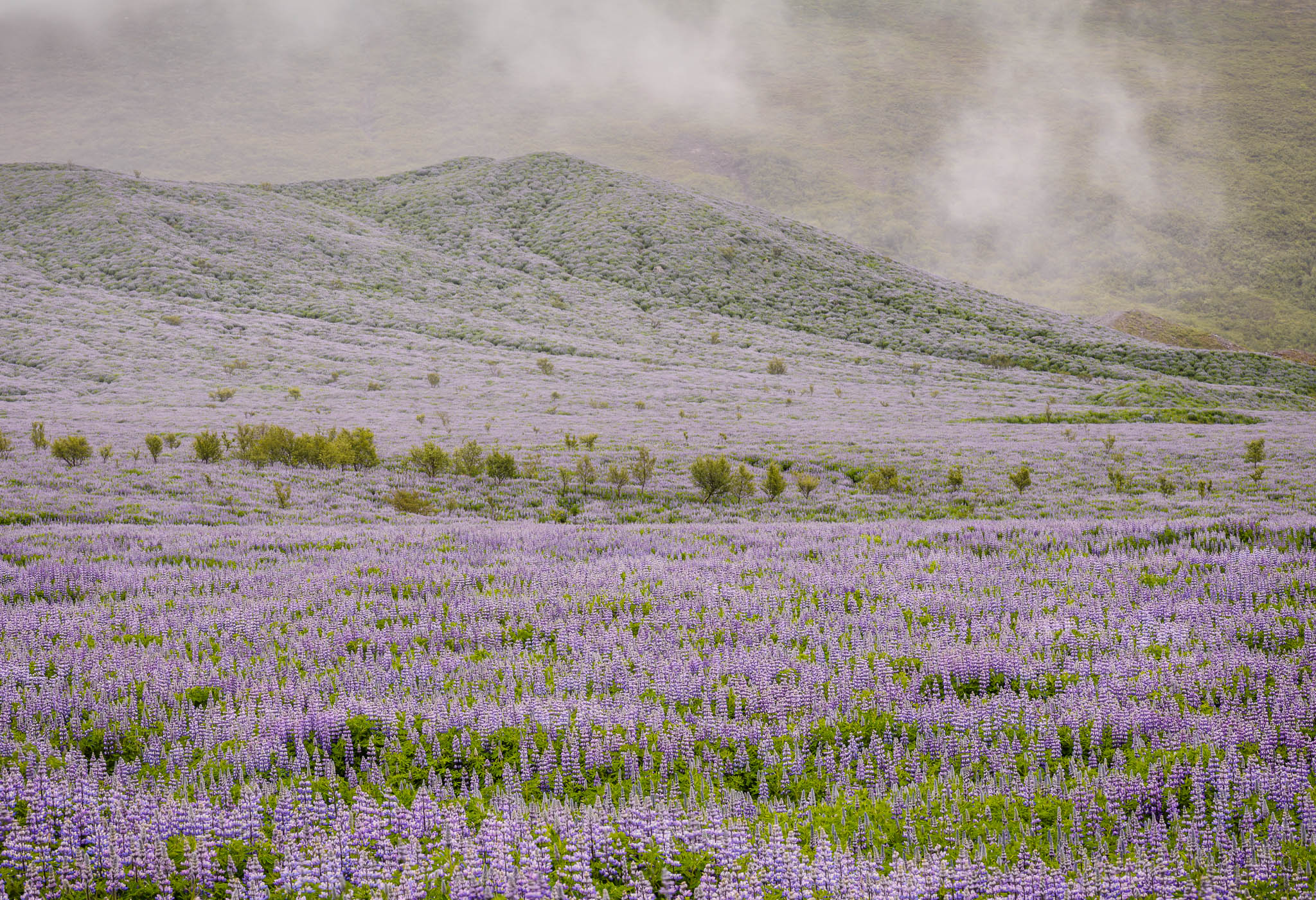
6. Violet
Violet is perhaps the rarest color to see in its pure form in nature, usually found only in very specific sunsets or flowers. Although historically associated with royalty and riches, the color violet in photography takes on many of the same connotations as blue; in fact, it most commonly appears in the world as a mixture with blue, forming a bluish-violet color in the sky or sea.
The color violet has a sense of tranquility to it – a calmness that is pleasant and often unexpected. If you ever have the chance to photograph a display of this rare color, like lupine flowers in bloom, make the most of it; violet is unusual enough that it makes your photos stand out.
 NIKON D800E + 105mm f/2.8 @ 105mm, ISO 100, 1/6, f/16.0
6. البنفسجي
ربما يكون اللون البنفسجي هو أندر لون يمكن رؤيته في شكله النقي في الطبيعة، وعادةً ما يوجد فقط في غروب الشمس أو الزهور المحددة جدًا. على الرغم من ارتباطه تاريخيًا بالملوك والثروات، فإن اللون البنفسجي في التصوير الفوتوغرافي يحمل العديد من الدلالات نفسها مثل اللون الأزرق؛ في الواقع، يظهر بشكل شائع في العالم كخليط مع اللون الأزرق، ليشكل لونًا بنفسجيًا مزرقًا في السماء أو البحر.
اللون البنفسجي له إحساس بالهدوء – هدوء لطيف وغير متوقع في كثير من الأحيان. إذا أتيحت لك الفرصة لالتقاط صورة لهذا اللون النادر، مثل أزهار الترمس المتفتحة، فاستفد منها إلى أقصى حد؛ اللون البنفسجي غير معتاد بدرجة كافية لجعل صورك بارزة.
نيكون D800E + 105 مم f/2.8 @ 105 مم، ISO 100، 1/6، f/16.0
-
Color Harmonies and Relationships
Just as important as individual colors are the ways in which they interact. This varies from simple color contrasts to complex harmonies; the real world has almost endless variety in color. Some of these relationships work better than others, though it will take a bit of practice – and often some post-processing – to get exactly the result you want.
تناغمات الألوان والعلاقات
لا تقل أهمية الألوان الفردية عن الطرق التي تتفاعل بها. ويتراوح هذا من تباينات الألوان البسيطة إلى التناغمات المعقدة؛ العالم الحقيقي لديه تنوع لا نهاية له في الألوان. تعمل بعض هذه العلاقات بشكل أفضل من غيرها، على الرغم من أن الأمر سيتطلب القليل من التدريب – وغالبًا ما يكون بعض المعالجة اللاحقة – للحصول على النتيجة التي تريدها بالضبط.
- **
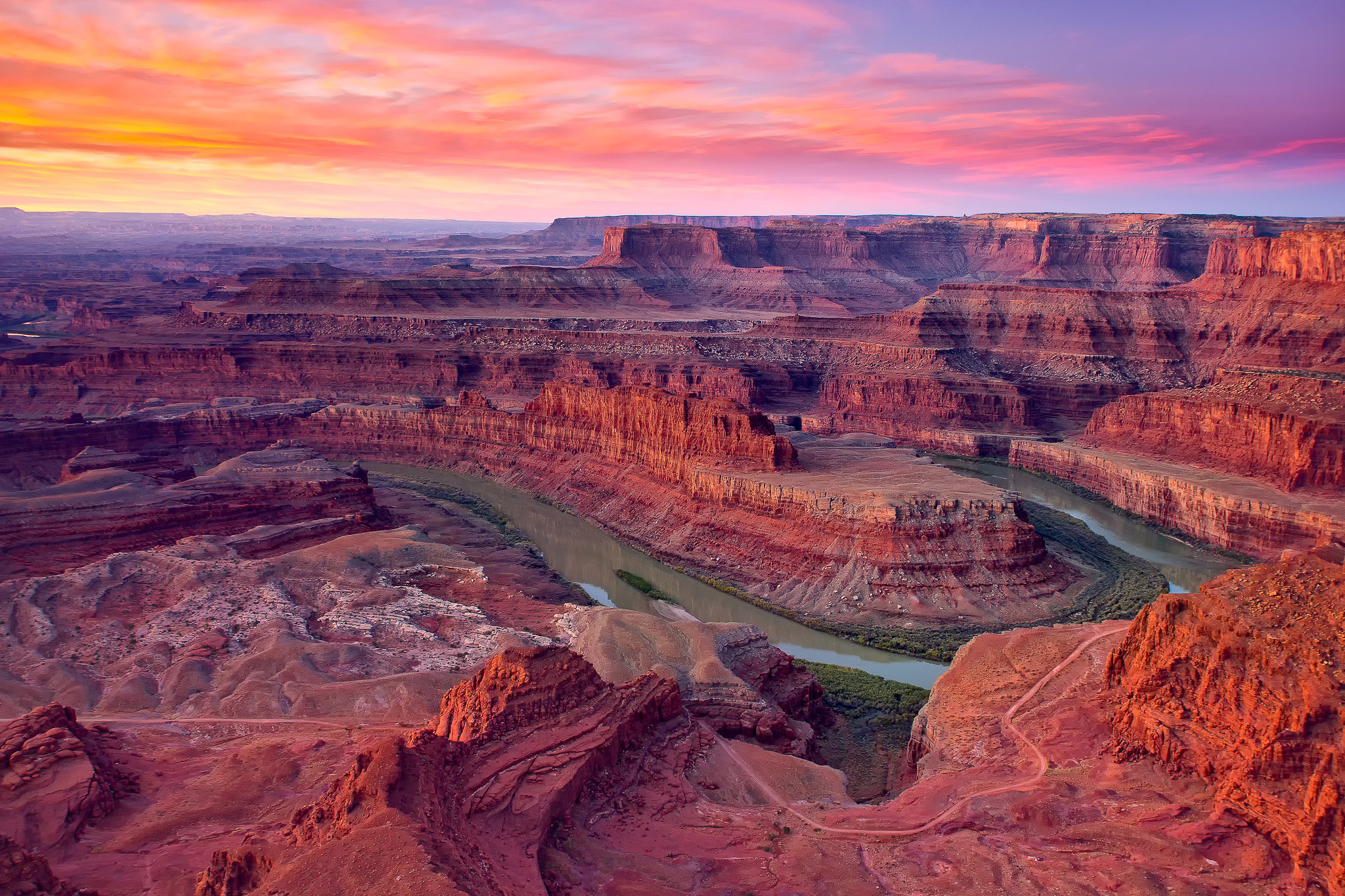
1. Warm and Cool ColorsAs mentioned a few times so far in this article, the difference between warm and cool colors is an important one. When both types appear clearly in the same photo, they form a strong color contrast that can be a focal point of interest.
In classic color theory, every cool color’s complement (opposite) is a warm color, and vice versa. Red and green are complements; so are orange and blue, as well as yellow and violet.
One important part of complementary colors is that they have inherent contrast when placed next to one another in a photo, similar to a composition that juxtaposes black and white. Take a look at the photo below, for example:

- NIKON D800E + 14-24mm f/2.8 @ 18mm, ISO 100, 1/60, f/13.0
There are only two dominant colors in the image above, blue and yellow-orange, and they intersect in a few different areas. One of the most important is the sky, where the warm cloud sits against a cool background. In the black and white version of this photo, there is very little separation between the two, and therefore not as much attention drawn to the top of the photo. But in color, the strong contrast draws attention to the sky, making it a very important element of composition.
1. الألوان الدافئة والباردةكما ذكرنا عدة مرات حتى الآن في هذه المقالة، فإن الفرق بين الألوان الدافئة والباردة هو أمر مهم. عندما يظهر كلا النوعين بوضوح في نفس الصورة، فإنهما يشكلان تباينًا قويًا في الألوان يمكن أن يكون نقطة محورية للاهتمام.
في نظرية الألوان الكلاسيكية، كل لون مكمل (معاكس) لكل لون بارد هو لون دافئ، والعكس صحيح. الأحمر والأخضر مكملان. وكذلك البرتقالي والأزرق، وكذلك الأصفر والبنفسجي.
أحد الأجزاء المهمة من الألوان المكملة هو أنها تحتوي على تباين متأصل عند وضعها بجانب بعضها البعض في الصورة، على غرار التركيب الذي يجمع بين الأسود والأبيض. ألق نظرة على الصورة أدناه، على سبيل المثال:
كاميرا نيكون D800E + 14-24 مم f/2.8 @ 18 مم، ISO 100، 1/60، f/13.0
لا يوجد سوى لونين مهيمنين في الصورة أعلاه، الأزرق والأصفر البرتقالي، ويتقاطعان في مناطق قليلة مختلفة. واحدة من أهمها هي السماء، حيث تقع السحابة الدافئة على خلفية باردة. في النسخة بالأبيض والأسود من هذه الصورة، هناك مسافة قليلة جدًا بين الاثنين، وبالتالي لا يتم جذب الكثير من الاهتمام إلى الجزء العلوي من الصورة. لكن في اللون، يلفت التباين القوي الانتباه إلى السماء، مما يجعلها عنصرًا مهمًا جدًا في التكوين.
-
2. Complementary Colors and Other Relationships
Several other color relationships are said to be attractive, such as a combination of the three primary colors (red, yellow, and blue). The same is true of colors between the ones listed above, like yellow-orange or blue-green, which have their own sets of complements as well.
Although I don’t dismiss the idea that these more complex color harmonies are often beautiful and emotive, the reality is that this discussion can get quite tangled when discussing three or more colors. Quite simply, real-world colors are not like painting. In most cases, you can’t choose a perfect blue-green to harmonize with equal parts red and orange; reality is messier than that.
If you want to delve into deeper discussions on color harmonies and relationships, there is no harm in doing so, and potentially some interesting information to learn. But my main recommendation is just to look at the scene in front of you and try to picture if its color “looks right” to your eye. That is far from be precise, but there’s more value to a gut feeling in photography than in trying to match an ideal that you may not find in the real world.
The one exception is in the post-processing stage, when you have a bit more flexibility to shift the hue and saturation of the colors in your image. In that case, it’s worth spending the time to edit the photo in a way that harmonizes well, either by a color wheel definition or, more probably, just something that looks good to your eye.
 Perhaps the colors in this image fit with a particular scheme of color harmonies; perhaps they don’t. But to my eye, the colors work well together. That’s what attracted me to capture and post-process this image the way I did in the first place.
2. الألوان المكملة والعلاقات الأخرى
يقال إن العديد من علاقات الألوان الأخرى جذابة، مثل مزيج من الألوان الأساسية الثلاثة (الأحمر والأصفر والأزرق). وينطبق الشيء نفسه على الألوان بين الألوان المذكورة أعلاه، مثل الأصفر البرتقالي أو الأزرق والأخضر، والتي لها مجموعاتها الخاصة من المكملات أيضًا.
على الرغم من أنني لا أستبعد فكرة أن تناغمات الألوان الأكثر تعقيدًا غالبًا ما تكون جميلة وعاطفية، إلا أن الواقع هو أن هذه المناقشة يمكن أن تصبح متشابكة تمامًا عند مناقشة ثلاثة ألوان أو أكثر. بكل بساطة، ألوان العالم الحقيقي ليست مثل الرسم. في معظم الحالات، لا يمكنك اختيار اللون الأزرق والأخضر المثالي للتناغم مع الأجزاء المتساوية من اللون الأحمر والبرتقالي؛ الواقع أكثر فوضى من ذلك.
إذا كنت تريد الخوض في مناقشات أعمق حول تناغم الألوان وعلاقاتها، فلا ضرر من القيام بذلك، ومن المحتمل أن تتعلم بعض المعلومات المثيرة للاهتمام. لكن توصيتي الرئيسية هي مجرد النظر إلى المشهد الذي أمامك ومحاولة تصور ما إذا كان لونه “يبدو مناسبًا” لعينك. هذا أبعد ما يكون عن الدقة، ولكن هناك قيمة أكبر للشعور الغريزي في التصوير الفوتوغرافي مقارنة بمحاولة مطابقة المثل الأعلى الذي قد لا تجده في العالم الحقيقي.
الاستثناء الوحيد هو في مرحلة ما بعد المعالجة، عندما يكون لديك قدر أكبر من المرونة لتغيير تدرج الألوان وتشبع الألوان في صورتك. في هذه الحالة، من المفيد قضاء الوقت في تحرير الصورة بطريقة تتناغم بشكل جيد، إما عن طريق تعريف عجلة الألوان أو، على الأرجح، مجرد شيء يبدو جيدًا لعينك.
ربما تتناسب الألوان الموجودة في هذه الصورة مع نظام معين من تناغمات الألوان؛ ربما لا يفعلون ذلك. لكن من وجهة نظري، الألوان تعمل معًا بشكل جيد. وهذا ما جذبني لالتقاط هذه الصورة ومعالجتها بعد ذلك بالطريقة التي فعلتها في المقام الأول.
- Conclusion
Color is one of the deepest topics in photography, but it carries emotions so strongly that it is worth trying to think about its characteristics consciously whenever possible. I often find myself working to make a photo as simple and unified as possible, with just a single color that dominates the frame. Or, if conditions are right, looking for a warm-cool split can result in photos that draw a lot of attention, much like shooting with high contrast.
However, the most important part about color at the end of the day is simply what looks good to your eyes. Whether in the field or in post-production, the colors you choose have a major impact on your personal style; some famous photographers have a “look” to their images that’s largely due to their color palette. So, once you understand the fundamentals of color, it’s best to take this information and make it your own.
*خاتمة:يعد اللون أحد أعمق المواضيع في التصوير الفوتوغرافي، ولكنه يحمل مشاعر قوية لدرجة أنه يستحق محاولة التفكير في خصائصه بوعي كلما أمكن ذلك. غالبًا ما أجد نفسي أعمل على جعل الصورة بسيطة وموحدة قدر الإمكان، مع لون واحد فقط يهيمن على الإطار. أو، إذا كانت الظروف مناسبة، فإن البحث عن تقسيم دافئ وبارد يمكن أن يؤدي إلى صور تجذب الكثير من الاهتمام، تمامًا مثل التصوير باستخدام التباين العالي.
ومع ذلك، فإن الجزء الأكثر أهمية فيما يتعلق بالألوان في نهاية اليوم هو ببساطة ما يبدو جيدًا لعينيك. سواء في الميدان أو في مرحلة ما بعد الإنتاج، فإن الألوان التي تختارها لها تأثير كبير على أسلوبك الشخصي؛ بعض المصورين المشهورين لديهم “نظرة” على صورهم ويرجع ذلك إلى حد كبير إلى لوحة الألوان الخاصة بهم. لذلك، بمجرد فهمك لأساسيات اللون، فمن الأفضل أن تأخذ هذه المعلومات وتجعلها خاصة بك.